Flexbox Cheat-sheet

What is Flexbox?
Flexbox is a layout used to flexible and responsive structures. It is declared using display: flex.
Following are some of the most commonly used Flexbox properties:
flex-direction
flex-direction is used to specify the directions in which the items inside the flexbox are placed. It can take the values:
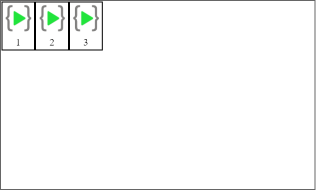
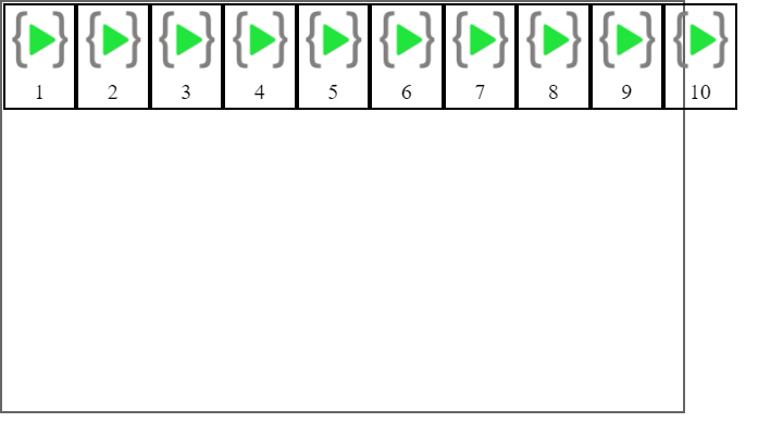
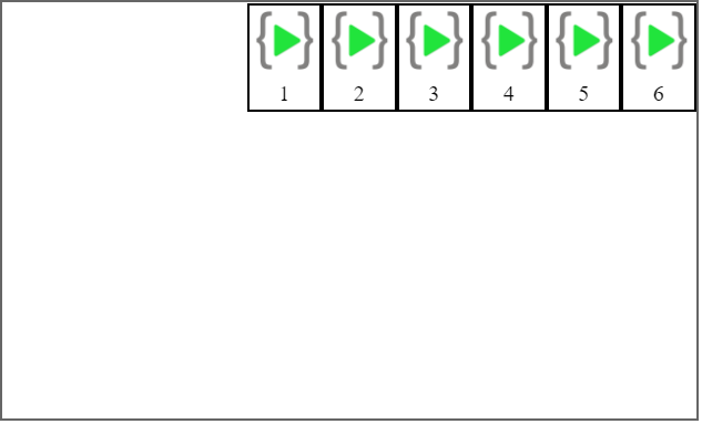
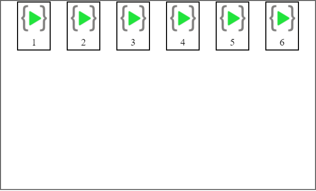
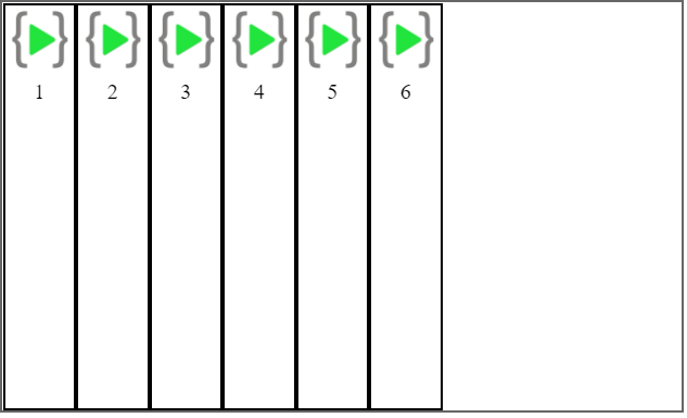
flex-direction: row
The contents will be placed from left to right. This is the default value of flex-direction.
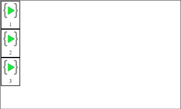
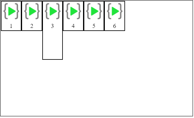
flex-direction: column
The contents will be placed from top to bottom.
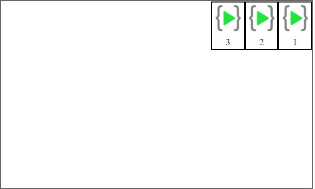
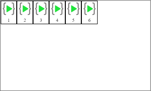
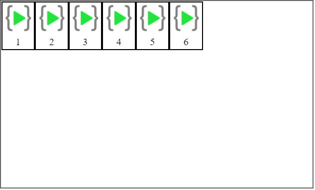
flex-direction: row-reverse
The contents will be placed from right to left.
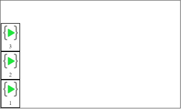
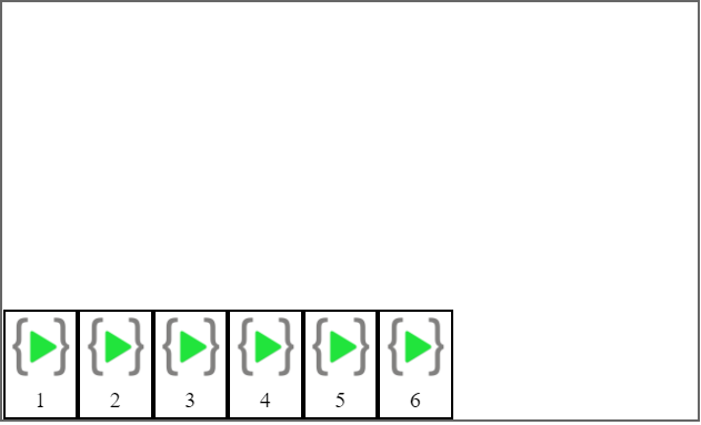
flex-direction: column-reverse
The contents will be placed from bottom to top.
flex-wrap
flex-wrap is used to determine whether the flex container will be single line or multi-line. The direction of the cross-axis can also be changed using flex-wrap.
flex-wrap can take the following values:
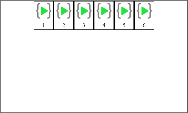
flex-wrap: nowrap
The container will be single-lined. This is the default value.
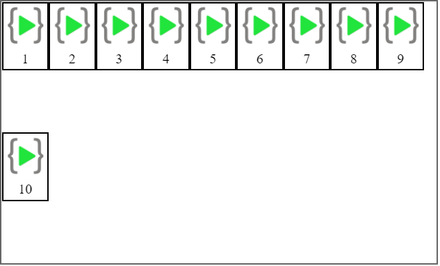
flex-wrap: wrap
The container will be multi-lined.
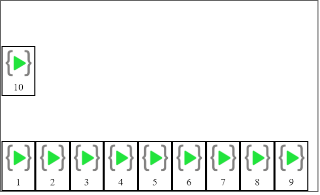
flex-wrap: wrap-reverse
The container will be multi-lined and the direction of the cross-axis is opposite of it's original direction.
justify-content
justify-content is used to align the contents of the container along the main axis. It can take the following values:
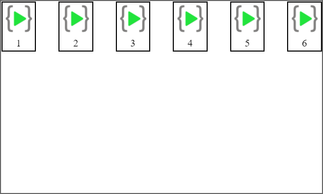
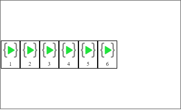
justify-content: flex-start
Items are aligned towards the start of the main axis. This is the default value.
justify-content: flex-end
Items are aligned towards the end of the main axis.
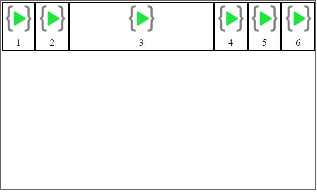
justify-content: center
Items are aligned at the center of the main axis.
justify-content: space-between
Items are distributed evenly along the main axis.
justify-content: space-around
Items are spaced with half-size spaces on either end.
justify-content: space-evenly
Items are distributed evenly along the main axis with full-sized space on both sides.
align-content
align-content is used to align items along the cross-axis. It also has similar properties to justify-content like flex-start, flex-end, space-between, space-around and center, barring the following exception:
align-content: stretch
Items stretch along the cross axis to take the remaining space.

align-items
align-itemsis used to align items relative to each using their edges and center axis. It can take the following values:
align-items: auto
Defers cross-axis alignment control to the value of align-items on the parent container.

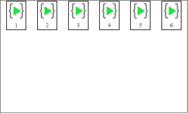
align-items: flex-start
Aligns top edges of items align the top edge of the line.
align-items: flex-end
Aligns bottom edges of items align the bottom edge of the line.
align-items: center
Aligns items along their center axis.
align-items: baseline
Items align such that their baselines align.
align-items: stretch
Items are stretches along the cross axis.
flex-grow and flex-shrink
flex-grow determines how much of the remaining space in the flex container should be assigned to an item.
On the other hand, if the size of all flex items put together is larger than the size of the flex container, flex-shrink is used to decide the factor by which a number shrinks.
Numbers are passed as values to flex-grow and flex-shrink